5 Reasons Why an Online Presence is Essential

These days a business without a website is almost unheard of. However, smaller and local businesses sometimes don’t take the plunge and get one of their own. They assume that their loyal customers and word of mouth will see them through. These are also the businesses which are almost destined to fail, as people simply don’t know enough about them to decide to visit.

According to Google, “50% of consumers who conduct a local search on their smartphone visit a store within a day, and 34% who search on computer/tablet do the same.Do you really want to miss out on that many potential customers? If that’s not a compelling argument to keep your site updated, read on for more reasons.


Your business is more accessible

Some people don’t want to call a business to find out more. Whether they want to know your opening hours or place an order, there will always be another business who is more accessible. These businesses will post their hours online, take orders on their website and display their location.

Those who work 9-5 won’t have time to call in to check on these things. They will just go to a company whose information they can access at a time more suited to them. This can also apply to busy families who will want to check things out once the kids are asleep.

If your business is in an obscure location such as a business park or back of a shopping centre, it’s unlikely that you’ll have many customers walking by.  They’ll need a reason to come to your little corner, whether it’s your amazing product range that no other store in town has or your glowing reviews. Don’t expect people to be able to find you ‘just because’. It won’t happen.

Get business from out of town

If you’ve ever been on holiday, you’ve probably had a look online for what’s in the local area before you even book your trip. Put yourself in the shoes of someone on holiday. Even if you are getting by on local customers, you can increase the number of people you get through your door if you let tourists know where you are. Without a website, reviews and products to view, how on earth are these people going to know you exist?

If you’re a company which provides a shipping service or a product which can be delivered online or over the phone, you can get business from out of town by having a website. With these products, people will care less about the location and more about the quality.

If your tool shop delivers but only has one location and no website, how is a builder from another county supposed to know about the great sale you have on saws right now? With a website, you become accessible to everyone. 

Build trust and relationships with customers

By being able to read your company’s honest reviews and feedback, your customers will feel a lot more secure in their purchasing. They can read about what works, what doesn’t, the quality of service and so much more.

As a bonus, allowing reviews to be made lets you respond to any negative ones in a helpful and constructive way. This also gives you a platform to show how professional you are. Remember to always take the conversation about a negative experience to private messaging.

If you have no review system, your company can look quite shady and people will assume you’re a bit of a con or too new to be worth doing business with. All these potential customers will move on to the next company with 4-5 star reviews. Think about all that business you’re losing!

Having social media and a blog also allows you to showcase many positive things about your business. For example, a company Instagram account can be used to show a human side to your business which makes you seem a lot more friendly and approachable. Blogs directly addressing issues your customers may be facing shows that you care and are listening to their problems. None of this would be able to happen without an online presence.

Free up your time

Taking phone calls all day, every day can become tedious. What time do you open? Do you have x in stock? What time do you close? This can all be fixed with adequate and correct online information. Your Facebook, Google My Business and website should all have the same opening times. Your website should have a ‘check stock’ button. These are very easy and quick things to do and will save you so much time as well as free up your phone line.

Taking orders online is one of the cheapest, quickest and most secure ways of completing a transaction. By doing it this way you minimise mistakes through human error and leave a paper trail that protects both parties in case of a computer mistake.


Makes you shareable

A great online advertising campaign, inspiring social media posts and a compelling website can really get you noticed as a small business. Building followers through blogging and sharing on social media get your products noticed by more people.

By creating things that people want to see, they will be more tempted to share your content. This gets you seen by more and more people, which is exactly what you want.

If a customer is trying to recommend you to a friend or colleague, they may struggle with an adequate description of the services you provide. Have a website you can link to, posts users can tag each other in and blogs that people find useful. People love to share things, so make sure you have something worth sharing.

4 Common Logo Design Mistakes

Your logo appears everywhere. Staff uniform, business cards, website. If you don’t have the ‘right’ logo, your company likely won’t be taken seriously. Getting the look down is one of the hardest parts of creating a brand, so we’ve made a list to make sure you don’t make the same mistakes as many people have before you.


Not representing your company

Taking a stock illustration and shoving your company name over the top isn’t going to cut it. Having a generic logo which doesn’t fully encompass the ‘feel’ of what you do is a huge mistake. Logos are often the first impression that people get when finding out about your business, so it’s important that you get it right.

Your logo should clearly define what industry you’re in. For example, a dentist might incorporate a tooth into the design. Take it one step further and define what exactly you do in your field – a dentist which specialises in children and families might choose a logo which incorporates a ‘parent’ tooth and a ‘child’ tooth. From a glance at the logo, you are able to infer that the company behind the logo is a dentist’s practice which caters to families.

Your logo should not be an incredibly generic shape or object with pretty colours added. It should be a clear indication of what you’re about, and a rainbow windmill design won’t do you any favours.

The examples below should be avoided at all cost unless it really represents your company. The first one is immediately associated with lawyers, the second with bereavement due to the colours used, the third with a vet or pet company. The last two are so ambiguous and random that by looking at the logo alone, you won’t be able to tell what company it represents.

Use an experienced designer who knows how to communicate the industry and the values your company represents.


generic logo

Being difficult to read

Your logo will appear everywhere. What looks good on your website may not translate well to leaflets and business cards. It may even be a huge issue when you print onto uniforms for your employees. If you go for embroidered polos, for example, it may become impossible to get the design you were hoping for due to a complicated font.

Any writing in your logo should be clear, legible and preferably sans-serif for ease of reading. On websites, you’ll often find Helvetica, Lato or Open Sans being used, or a variation of them. This is because they’re easy to read on a screen as well as other media. PT Sans and Arial are other popular choices, along with many other amazing fonts.

There are exceptions to this rule but we generally go with simple fonts. These translate well to any size and are generally still legible even in business card sizes.

bad font for logo

An example of an awful font to use is ‘Halloween Spider’. Can you imagine printing this on a business card where you only have centimetres of space? You would have to fill up one side with just so your clients could read your company name. This font could work well as part of a Halloween promotion, but leave it alone for everything else!


Complicated design


Visubad logo exampleally, your logo should be sleek and pleasing to look at. Aiming for a simple symbol that’s related to your industry is great. Non-offensive and complimentary colours should be used as far as possible and the design itself should be simple. A great rule for checking if your logo is ‘simple’ enough is testing whether it can be printed in grayscale. Bonus points if you can entirely reverse the colours on the images and still easily recognise it.


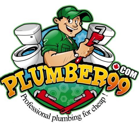
The plumbing logo is one that we would consider to be overcomplicated. There are so many elements and colours used that it’s busy and overwhelming. They get docked points for having a serif font for their slogan too – imagine polo shirts being embroidered with that?

The WWF logo is clean, simple and timeless. It can be used everywhere at any size and people will still be able to recognise it. It can be reversed, printed in grayscale, flipped and twisted and it will still make sense. Plus, the full version uses a sans serif font too!


Bad choice of colours

If the colours in your logo make your eyes hurt, it’s time for a change. Using complementary colours which are associated with your industry is the best way to go. Gaudy blue and yellow fonts are bad taste at best. At worst it’s unprofessional and clients won’t take you seriously.

Using colour charts, mood boards and lots and lots of research can help you avoid blunders like this. Switching up your colour palette once you’ve got a few things printed isn’t advisable as this can affect your branding negatively, so we recommend being certain about your choices from the beginning.

Using a colour wheel can help you visualise which colours go with which and which combinations should be avoided. That doesn’t mean that blue and yellow shouldn’t go together, though. Choosing complimentary hues of clashing colours can make any combination of colour go together. It’s also great to know where to put them so that they look great together instead of gaudy. 

Consulting a professional is always a good idea if you don’t have a background in design. They know how to help you pick colours and come to a final decision about what you want from your logo.


Best Summer Promotional Products

Summer is a brilliant time to get your brand’s name out there. Food festivals, beer festivals, street parties, parades and sporting events are on, especially since the kids are out of school. Getting your brand noticed isn’t just about getting a spot at an event and talking to people. It’s about leaving a lasting impression on those you do talk to. How do you make sure they remember your brand among the multitude of others who attended the same event as you?

Giving away products looks great for your brand. Giving away higher ticket items makes your company look great, and you’ll become associated with great feelings. We recommend giving away smaller products such as pens and wristbands with every enquiry. Items which cost more to produce are best given away to hot leads. A fun way to give away high ticket items at an event is by holding a competition at your table. This gives you a chance to win something ‘big’ like a hat or beach ball while drumming up some interest around your company and getting people involved.


Transportable

During the summer months, event-goers are going to be very hot and probably a bit overstimulated at some point. They will have packed the bare minimum and be carrying bottled water. What they don’t want to be carrying around with them is a tote bag full of leaflets and heavy brochures. That’s an easy way to get your promotional material put in the bin before it even gets to someone’s car.

Your promotional material should be small enough that it’s not a bother to carry it with you. If it is, then it should provide something for the person carrying it. A perfect example of this would be a weepul.

These are cute, fluffy and have sticky feet so they can be carried on bags, t-shirts and hats while being no extra burden. These are great for events with children, as they’ll all want a googly-eyed bug for themselves. One downside to these is that they’re often thrown away, lost or destroyed by the end of the day. However, they’re quite cheap to make and if the weepul does make it home then they can stick around for ages.

weepulWeepuls often come with long strips of paper attached where you can fit your company name, logo, slogan and contact details. These can be annoying for the wearer though, so they often get ripped off and thrown away. Don’t take these too seriously and use them instead of leaflets and business cards, as their main purpose is to be cute, fluffy and draw families and kids to your table

Another option would be buttons and pins. These are slightly more permanent, less likely to fall off and more customisable. Buttons can be produced on a mass scale and given out to anyone who passes by your table. However, they’re too small to fit a slogan on without it being nearly impossible to read, so it’s best to stick to just a logo.


Wearable

During the summer, people are more likely to be wearing less. Shorts, t-shirts and trainers are a popular combination. With people’s wrists and arms on show, bracelets and wristbands would make an ideal item to give away. They’re visible to both the wearer and others who see it. If you make them fashionable enough, then they’re wearable on an everyday basis which is great for your company.

Another summer-centred giveaway item could be sunglasses. These are more expensive to produce than other items, so it’s best that these are given away as part of a purchase, to identified hot leads or even in a competition to increase brand awareness. Everyone needs sunglasses in the summer, and having something that can be used every day with a logo on it will keep your company in your prospect’s minds.

If you don’t want to go down the sunglasses route, another idea is baseball or bucket hats. These are great as they also provide protection from the sun, as well as having more space for a logo and slogan.

Having something to give away that is both wearable and adds value to your customer’s day is great, as they don’t have to carry anything extra and they’ll be happy to wear it and show it off.


Useable

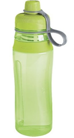
Providing a usable item which can be used again and again is a great way to keep your brand fresh in the minds of your prospects. For the summertime, what better way of accomplishing this than producing branded water bottles?

Water bottles have plenty of space on them for a logo, slogan and company contact details. These can be quite expensive to buy and very easy to lose, so anyone would be thankful to have one especially during warmer temperatures. They’re surprisingly cheap to produce at decent qualities and make great prizes for winners of small competitions run at events.


Fun

If you’re going to a festival or outdoor event as a business, providing something fun is a great way to entice people into coming to see what you’re about. Footballs, frisbees and beach balls are reusable, cheap to produce and have enough space for branding on them. They’re durable and families will always be grateful to receive something for the kids to keep them entertained. Your product could end up being used anywhere – beach, park, back garden.

Generally, these products will make great giveaways for hot leads and prizes for competitions at events, especially with kids and young adults.


Of course, some of the products listed here won’t be applicable to every company and every event. If you’re attending a school or networking event, pens and highlighters are a great choice. If you’re at a sports event, water bottles and t-shirts would be more appropriate. This is just a rough guide to which products are more popular in the summer months. Think about your company carefully and how you want to come across to the public at each event.

Print Advertising Isn’t Dead

Do your marketing efforts focus on having a sleek and streamlined digital presence? Then you’re doing it wrong. There’s nothing wrong with having a website which matches your social media and other online endeavours. Putting resources into having a unified image is what we’re all about. The issue is when a company invests too much time and money into online advertising.  

According to INMA, ‘ 82% of U.S. internet users trust print advertising when making a purchase decision, more than any other medium’. This is a significant statistic, considering only 61% trust search ads. If your advertising budget has no room for print ads, it might be time to reconsider your marketing spending.

Cool vs. Predictable


In this digital age, advertisers often get addicted to being cool. They attempt to wow the audience rather than keep them hooked. As much as we pretend it’s not true, our attention spans are decreasing. As soon as we see another cool thing, we’ve forgotten whatever we saw previously. Holding the attention of an audience is so tricky to achieve online, as it’s so simple to click away.

Print marketing has and always will be predictable. Unlike digital methods, readers know exactly what’s coming next. An online publication bombards you with information, internal and external links, sources, flashy adverts and more. When reading something as complex as a magazine, the audience knows what’s coming. This compels them to keep turning the pages. Being simple and predictable isn’t a bad thing when it comes to print, as it will keep your audience coming back for more.

Keeping it simple will also increase the chances of your message being remembered, as it’s not obscured by a noisy website. A page with just your content on will hold the attention of a viewer. A webpage with other distractions on it will take away from this experience.

Satisfaction


Once you’ve got your audience hooked, it’s easier to show them more content. Your digital content should answer questions that your audience want answering instantly. We search for answers via Google, and we’re satisfied with a sentence, a paragraph or an article. Rarely do we seek out different content from the same source if we’ve been satisfied already.

Print advertising changes that. By picking up a brochure, magazine, newsletter or leaflet, we expect answers to questions we didn’t know we had. The satisfaction comes from reaching the end of a piece of content, and it’s easy to turn the page for more. This is a great way to drive home your company message and deliver more great content to your audience.

Occupy space and thoughts


By having a physical copy of your content, you allow your brand to occupy both the space and thoughts of your audience. Information we see online is easily forgotten or misattributed and can be a noisy experience for the reader which adds to the confusion.

A copy of your magazine on a desk at work could spark a conversation. A supermarket newsletter sat on the kitchen counter serves as a reminder that your store exists. Often, your customers will associate having a heavy, glossy brochure or a nice-feeling matte catalogue with luxury and quality. Occupying the space of your audience allows you to occupy their thoughts, as opposed to a quickly forgotten website.

Even if your ad or flyer is unwanted, your audience will still be thinking about it as they fish it out the bottom of their bags to throw away.

Stand out


Having a physical version of your content will help you stand out, as well as benefit you in all the ways listed here. Whether you produce a simple business card or a magazine, you won’t be fighting for space online with hundreds of other people like you. Placing your physical copies somewhere like coffee shops, supermarket notice boards or in-store is a guarantee that people will see you. There’s no guarantee that people looking online will see your links, much less click on them.

It also makes you memorable as people take time out of their day to hold and take in the information you’re providing, without extra adverts and moving graphics. It’s a ‘safe’ way to get information, as there’s no threat of malicious links or having your data stolen.

Print ads also allow for a higher level of emotional response, as you can directly interact with what’s on the page by holding what you’re seeing. A great example of this is when IKEA produced lavender scented, white-noise emitting print ads. To advertise their mattresses in the UAE, they conducted research into how much sleep people were getting. They found that 9 in 10 people are getting less than 8 hours sleep a night, so they produced a resource targeted to them. This revolutionary new ad hit the headlines worldwide for its out of the box thinking, and rightly so.

While not all of us have the resources to produce such a complex ad, the principle applies. Print allows for a wide range of designs that the internet doesn’t. There’s no online equal to the IKEA ad, simply because it’s exciting to hold and to have. That, and computers can’t produce scents. Even something as simple as having business cards which are highly customised or an event-specific leaflet is exciting and allows for an emotional response.