For business owners, especially new sole traders, there’s always the urge to do everything yourself. Some of this could be because you’re excited and want to crack on with your ideas… and some is because you want to save money. However, there are some things you should be spending your budget on right from the start – and professional graphic design is one of those things.
Branding
Getting your branding right early on is going to be worth the cost. In actual fact you should be looking at graphic design as an investment, not an expense. It gets you off to the best possible start, and will no doubt save money further down the road. Otherwise you’ll end up looking at your original ‘home-made’ designs and realising you need to get serious if your business is going to grow – and that can potentially mean a complete re-brand.
Marketing Materials
A good Graphic Designer will work with you – taking the time to get to know your business and understand your target market. They can then start by designing you a strong company logo that is unique, recognisable, and makes you stand out from your competition. After that they can use it to create consistent designs across your entire range of marketing materials – that could be business cards, brochures and flyers, pop-up banners, vehicle livery, clothing, digital images, and anything else you need to promote your products and brand.
A Trusted Advisor
Before too long your graphic designer will know your business inside out, and even become a trusted advisor – someone you can rely on to advise you when you need it, much like like your accountant or IFA. They’ll also have such an understanding of your design requirements they’ll usually grasp the designs you want before you do. That makes creating or tweaking things when you need them really easy – and that’s the opposite of most people’s experiences on some well-known outsourcing websites.
Get in Touch
If you’re starting your business and you’d like to learn more about graphic design and how it could help you achieve your business goals, we’d like to hear from you. Absolute Creative is an innovative design agency based in Hertfordshire, and we work with businesses like yours all over the UK. You can read all about our award winning design on this page, and if you’d like to chat to us just call us on 01707 386 107 or email hello@absolutecreative.co.uk .
Why a Graphic Designer is Important for Your New Business was last modified: February 5th, 2019 by admin
Your logo appears everywhere. Staff uniform, business cards, website. If you don’t have the ‘right’ logo, your company likely won’t be taken seriously. Getting the look down is one of the hardest parts of creating a brand, so we’ve made a list to make sure you don’t make the same mistakes as many people have before you.
Not representing your company
Taking a stock illustration and shoving your company name over the top isn’t going to cut it. Having a generic logo which doesn’t fully encompass the ‘feel’ of what you do is a huge mistake. Logos are often the first impression that people get when finding out about your business, so it’s important that you get it right.
Your logo should clearly define what industry you’re in. For example, a dentist might incorporate a tooth into the design. Take it one step further and define what exactly you do in your field – a dentist which specialises in children and families might choose a logo which incorporates a ‘parent’ tooth and a ‘child’ tooth. From a glance at the logo, you are able to infer that the company behind the logo is a dentist’s practice which caters to families.
Your logo should not be an incredibly generic shape or object with pretty colours added. It should be a clear indication of what you’re about, and a rainbow windmill design won’t do you any favours.
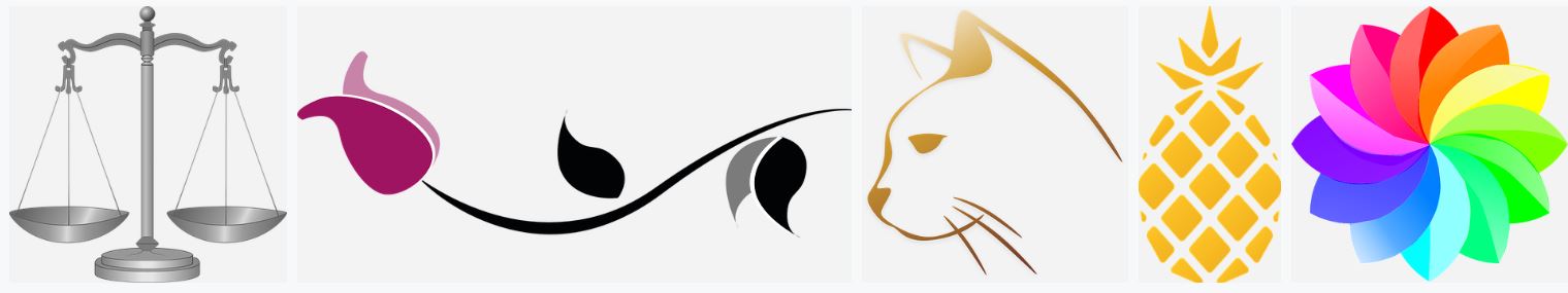
The examples below should be avoided at all cost unless it really represents your company. The first one is immediately associated with lawyers, the second with bereavement due to the colours used, the third with a vet or pet company. The last two are so ambiguous and random that by looking at the logo alone, you won’t be able to tell what company it represents.
Use an experienced designer who knows how to communicate the industry and the values your company represents.
Being difficult to read
Your logo will appear everywhere. What looks good on your website may not translate well to leaflets and business cards. It may even be a huge issue when you print onto uniforms for your employees. If you go for embroidered polos, for example, it may become impossible to get the design you were hoping for due to a complicated font.
Any writing in your logo should be clear, legible and preferably sans-serif for ease of reading. On websites, you’ll often find Helvetica, Lato or Open Sans being used, or a variation of them. This is because they’re easy to read on a screen as well as other media. PT Sans and Arial are other popular choices, along with many other amazing fonts.
There are exceptions to this rule but we generally go with simple fonts. These translate well to any size and are generally still legible even in business card sizes.
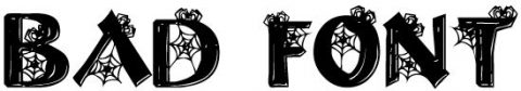
An example of an awful font to use is ‘Halloween Spider’. Can you imagine printing this on a business card where you only have centimetres of space? You would have to fill up one side with just so your clients could read your company name. This font could work well as part of a Halloween promotion, but leave it alone for everything else!
Complicated design
Visually, your logo should be sleek and pleasing to look at. Aiming for a simple symbol that’s related to your industry is great. Non-offensive and complimentary colours should be used as far as possible and the design itself should be simple. A great rule for checking if your logo is ‘simple’ enough is testing whether it can be printed in grayscale. Bonus points if you can entirely reverse the colours on the images and still easily recognise it.
The plumbing logo is one that we would consider to be overcomplicated. There are so many elements and colours used that it’s busy and overwhelming. They get docked points for having a serif font for their slogan too – imagine polo shirts being embroidered with that?
The WWF logo is clean, simple and timeless. It can be used everywhere at any size and people will still be able to recognise it. It can be reversed, printed in grayscale, flipped and twisted and it will still make sense. Plus, the full version uses a sans serif font too!
Bad choice of colours
If the colours in your logo make your eyes hurt, it’s time for a change. Using complementary colours which are associated with your industry is the best way to go. Gaudy blue and yellow fonts are bad taste at best. At worst it’s unprofessional and clients won’t take you seriously.
Using colour charts, mood boards and lots and lots of research can help you avoid blunders like this. Switching up your colour palette once you’ve got a few things printed isn’t advisable as this can affect your branding negatively, so we recommend being certain about your choices from the beginning.
Using a colour wheel can help you visualise which colours go with which and which combinations should be avoided. That doesn’t mean that blue and yellow shouldn’t go together, though. Choosing complimentary hues of clashing colours can make any combination of colour go together. It’s also great to know where to put them so that they look great together instead of gaudy.
Consulting a professional is always a good idea if you don’t have a background in design. They know how to help you pick colours and come to a final decision about what you want from your logo.
4 Common Logo Design Mistakes was last modified: August 21st, 2018 by Poppy Cruse Earle